Creating a brochure isn’t hard, but these tips are meant to make it even easier.
Do you want to know how to create a gorgeous practice brochure that people actually want to pick up and read? As a general rule, people like pretty things.
Newsflash – we know.
But appealing to this most basic human principle can help you attract and retain more patients immediately.
How, you ask? Put yourself in the shoes of a patient. You’re at a crowded, cramped community event and there’s a few medical offices there as part of their grassroots marketing efforts.
All of the booths look basically the same; so you grab a brochure from each as you walk around and try to find your child… who has run off either to the cotton candy guy at the end of the row or the bounce house at the complete opposite side of the event. Kids.
In this scenario the patient will, first, find their child – thank goodness. Then, when they get home, they might look through the pile of material they’ve collected and start throwing out the junk. You’ve got a split second to make a lasting impression on them.
Your material either looks better than your competitors… or it doesn’t.
They flip through both brochures, read about 8 words total, and keep the one that looks prettier. If that’s yours, odds are they’ll put it up on the fridge and remind themselves to make an appointment Monday. So, how can you ensure your brochure winds up on some prime fridge real estate?
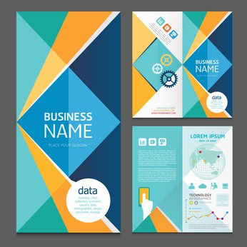
10 tips to making a great practice brochure
- Use big, happy photos. Always remember that you want to show the end result, not the pain in photos. Patients are experiencing discomfort; so all that matters is that they can get back to smiling and enjoying activities like riding a bike or sitting on the beach (like those pretty people in the photos) as soon as possible.
- Keep the word count down. People do not want to read so don’t make them read more than they have to. Think of simple statements. Keep your services listed in bullet form and speak to the pros of coming to your office first and foremost. No one will read the rest and it makes your brochure look intimidating.
- Use benefit-oriented headlines. When opening up the brochure for the first time, your patient will skim the headlines. Make sure your headlines grab their attention and help them down the page and through the copy.
- Headshots should be (somewhat) current. You can’t talk about all of your state-of-the-art, minimally invasive procedures and options right next to a headshot that was clearly circa 1987 (especially if your doctor has lost a few inches of hair since then). Keep headshots current to at least 5-6 years.
- Put your phone number and website everywhere. You want this information to be easy to find no matter where the brochure is seen. Front cover (in case it makes it to the fridge), inside while reviewing the content and on the back while it’s flipped over. Don’t overlook this easy opportunity to be found.
- Be careful whom you list. Typically, physicians stick around for a long time in a practice. PA’s, office managers and coordinators? Not as much. If you’re going to list staff, keep it to the doctors so you don’t have to redesign brochures annually to keep up with the new faces.
- Put your logo and relevant photo on the cover. Sounds like a no-brainer, right? You’d be surprised. As we mentioned in tip #4, also be sure to put your phone number and web address on the cover as well.
- Keep the look consistent with your website. Keeping the same look is known as a brand image. You want the same brand image across all of your marketing material. So, if you redesign your brochure and love the look, make sure your website follows closely behind.
- Use the right colors. Stick with colors that are often associated with medical practices like blue, green, white and light purple. Stay away from reds, blacks and grays whenever possible.
- Hire a good designer. “You get what you pay for” is especially true in the world of design. Do not try to do this in Microsoft Publisher in your spare time (hah) or use a staff member’s cousin. To really make an impact and keep the same design for multiple years you’ll want to spend the extra few dollars and have it professionally done.
There you have it. Regardless of the size of your practice or your resources, the tips found above will assist you in creating a brochure that properly represents your practice, impresses potential patients and earns you a spot on their fridge… all for being pretty.

